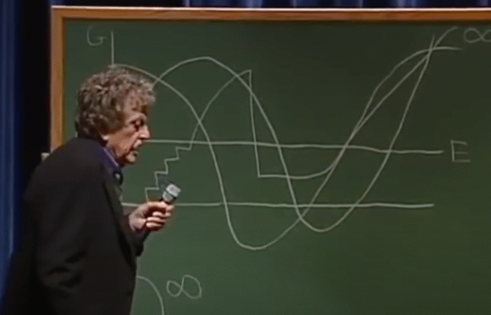
New to me, a couple decades ago, author Kurt Vonnegut delivered a lecture on the shape of stories. He uses a diagrammatic line chart to illustrate. The y-axis represents a range from ill fortune to good fortune, and the x-axis represents beginning to end of a story.
Vonnegut identifies four stories in the following video (and in a different lecture as a younger man), but poking around the internet, he seems to have illustrated eight at some point. I can’t find where the remaining four came from though.
The best part is that the ideas he charts are from his rejected master’s thesis, which he described in Palm Sunday:
What has been my prettiest contribution to my culture? I would say it was a master’s thesis in anthropology which as rejected by the University of Chicago a long time ago. It was rejected because it was so simple and looked like too much fun. One must not be too playful.
The thesis has vanished, but I carry an abstract in my head, which I will here set down. The fundamental idea is that stories have shapes which can be drawn on graph paper, and that the shape of a given society’s stories is at least as interesting as the shape of its pots or spearheads.
I guess the anthropology department at the University of Chicago was not a visualization fan at the time.
Watch the short lecture below.


